
LifeX - Brand Design
The challenge was to build identification and connection with our audience by projecting understanding and empathy.
-
The driving force behind the co-living industry is the lack of affordable and flexible medium-long term living options and a high level of loneliness amongst millennials working abroad.
-
We were fascinated by the community values and ideas that powered the collective movement that started in Copenhagen in the late 60s.
In the same city, 50 years later, much has changed, but the social powers of shared kitchens are the same. To scale the business, we had to learn how healthy friction can inspire communities to resolve their conflicts. LifeX used technology and convenient services like weekly cleaning to avoid more severe conflicts. LifeX has become a global leader amongst co-living companies, with more than 60 collectives.
-
LifeX was a full-time project. Head of design in LifeX meant being on a one-person design team. I was in charge of both the digital product design and the design of the apartments. My responsibility was to take both a strategic and an executional role in every project. For interior design, I often had support from architects for 3d modeling and space planning. In our digital product development, I shared the responsibility with our CTO. I was in charge of all the outward initiatives, and he headed inward initiatives like tooling, etc. I was conducting all the UX research internally and externally. In addition, I also provide overall creative direction for the marketing and real estate team's brand and tactical coms.

Our brand should promise a sense of home wherever you go, alleviating the vulnerabilities and worries that come with venturing into new environments and leaving the comfort of familiar surroundings behind.
Our members typically find themself at a crossroads of life.
By joining LifeX, they are able to connect with new people and places

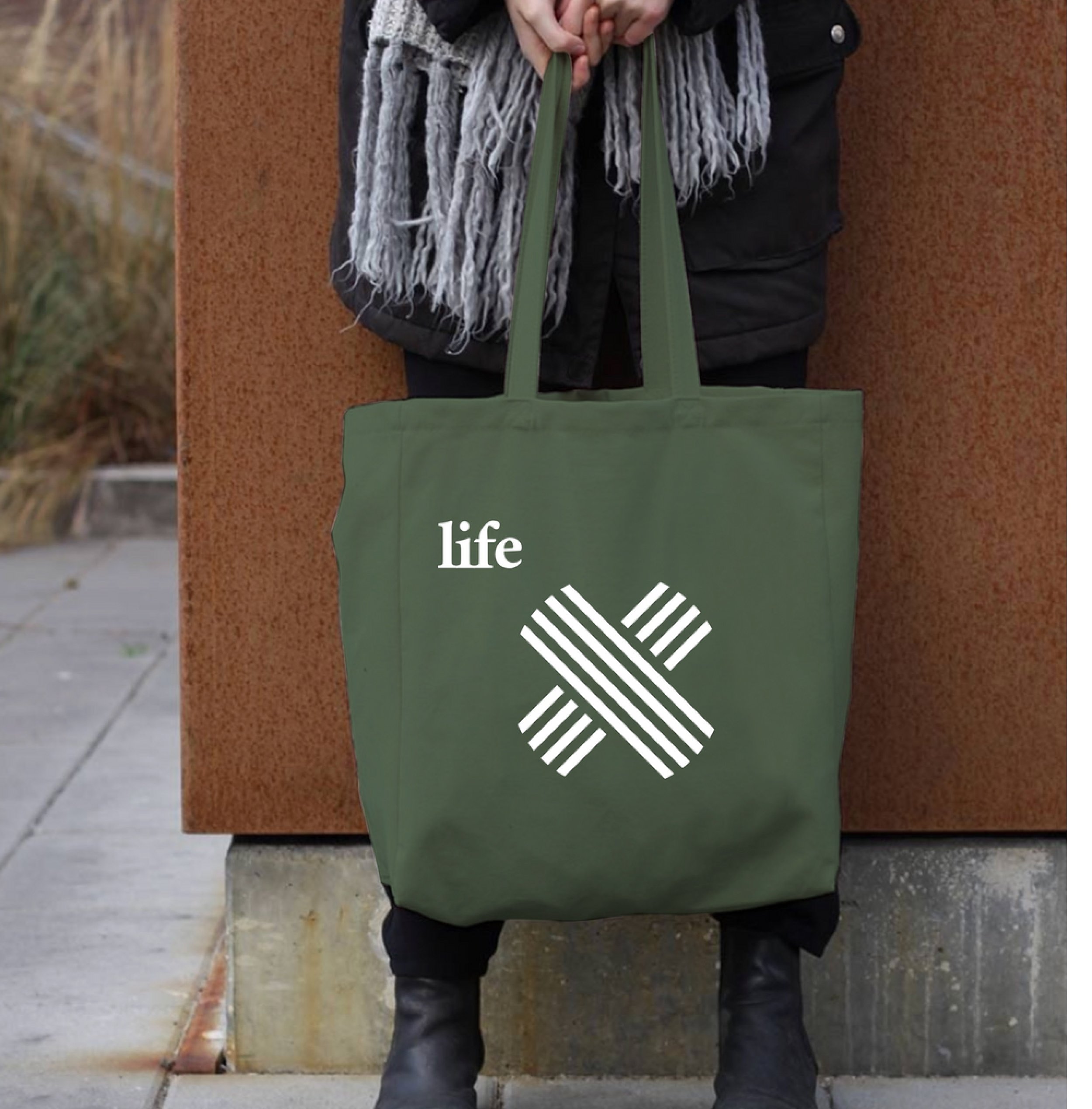
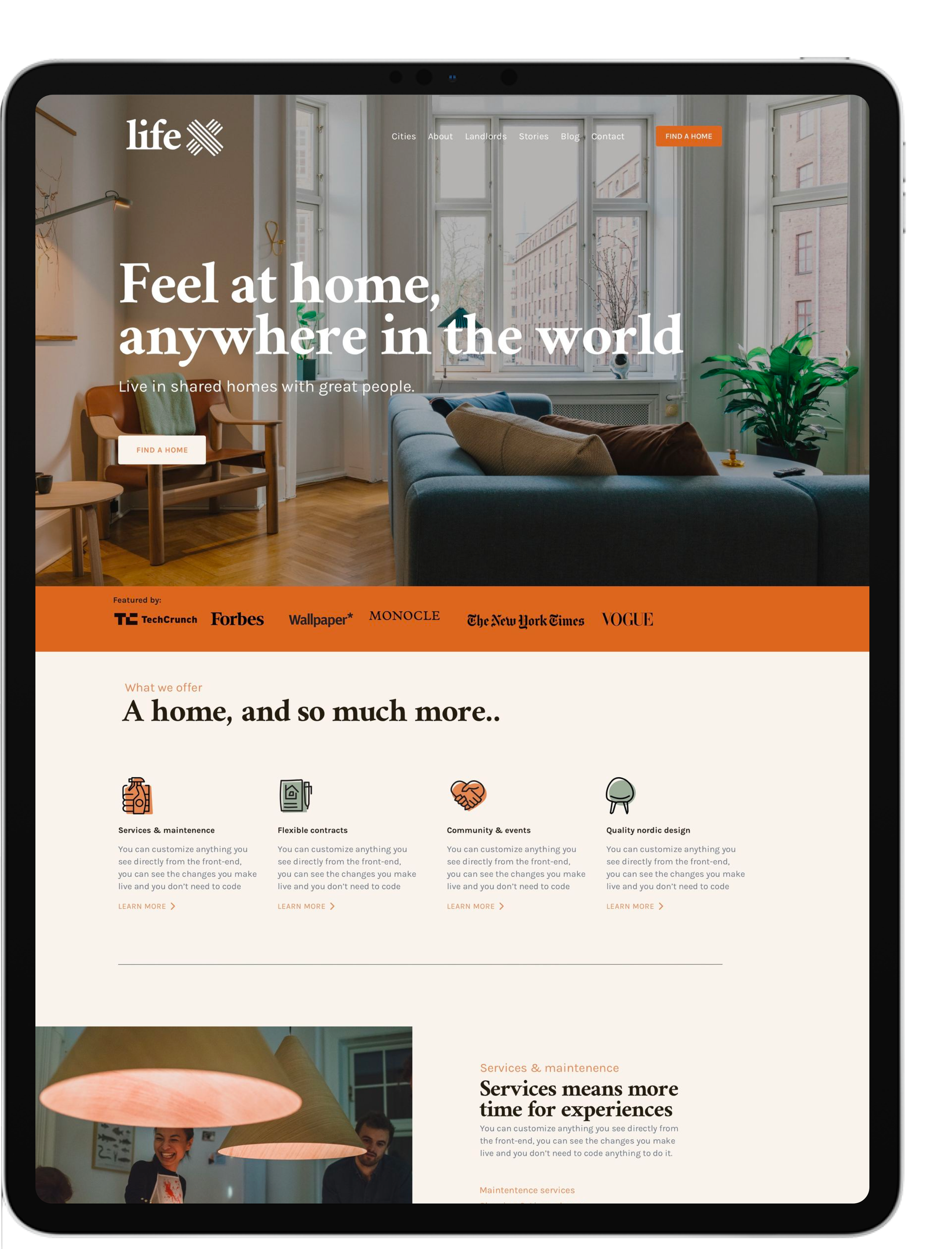
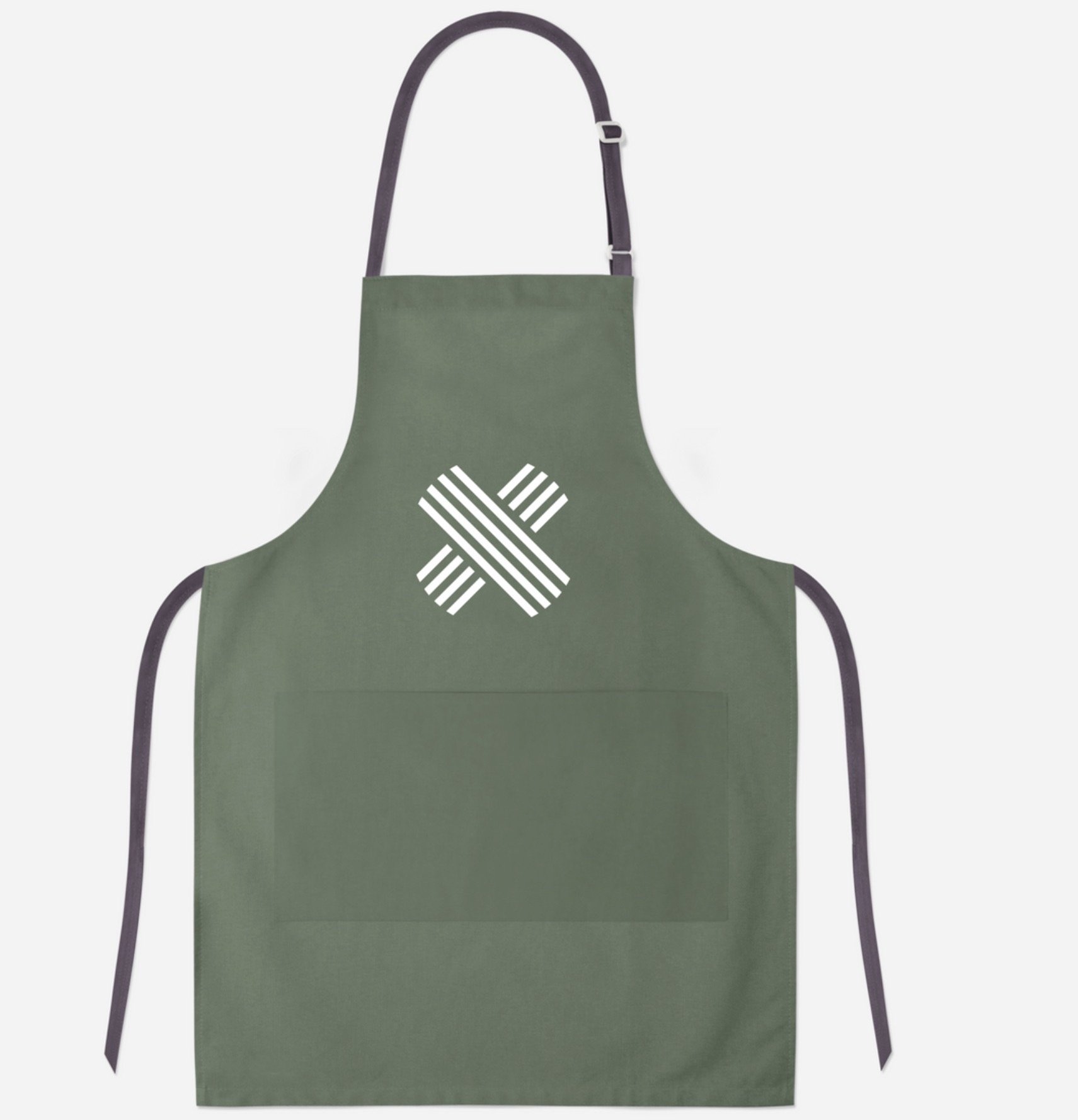
The existing name lacked significance and a compelling story. The X was transformed into a powerful symbol
representing LifeX's mission to connect people and places.

The typography of "Life" was made more rounded to emphasize it, and a new X monogram was introduced, giving the
brand a more human touch and better aligning with the company's values.

The vision was to make
our members feel at
home anywhere.
Brand framework
By using Carl Jung's archetype framework, we shaped the brand character to embody the explorer archetype, which reflects the mindset and motivations of many of our members. Our core value propositions are directly aligned with this brand character, ensuring a strong and meaningful connection.
-
Our members embody the spirit of an explorer, driven by a desire for authentic and fulfilling experiences. They travel and seek new friendships, always striving to avoid feeling trapped and confined.
-
The brand story celebrates the thrill of new adventures and experiences while also providing a sense of comfort and familiarity, giving our members the assurance that they can feel at home anywhere.
-
Freedom: With the flexibility to settle anywhere, our members can always feel free and in control of their own lives.
Belonging: As a member of our caring community, there is no need to feel alone or restless. Instead, a sense of belonging and connection is always within reach.

The process of shaping the brand's character began with a comprehensive one-pager outlining all the essential visual components.

The choice of green as the brand color was a deliberate one, as it symbolizes exploration and growth. The hue evokes the image of lush, uncharted territories waiting to be discovered, while also exuding a sense of tranquility and peace. This combination of excitement and reassurance perfectly captures the essence of the LifeX brand, which offers its members the freedom to explore new places and make meaningful connections, all within a supportive community.

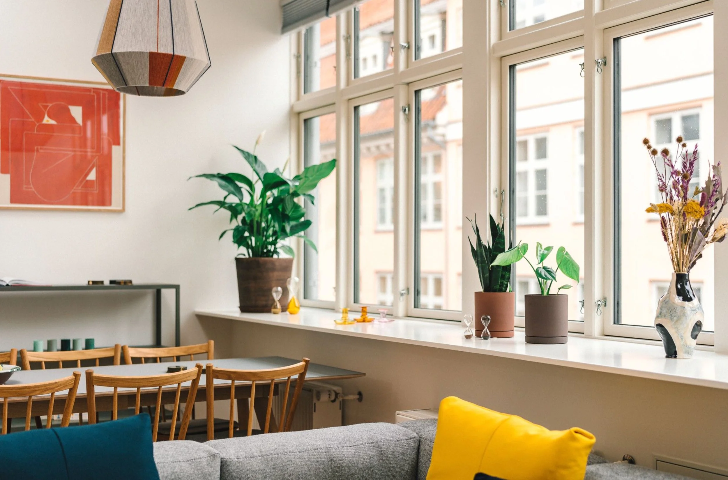
Our brand colors were applied to the physical space, creating a seamless connection between the brand and the experience.



The result
Our brand identity embodies a warm and welcoming atmosphere, reflecting the essence of the product experience. It's crafted based on in-depth insights and data about our target audience.

Related cases
-

Product Design
New digital tools made onboarding frictionless, but building a self-sufficient community infrastructure was the real challenge.
-
Interior Design
Beyond visual and functional consistency, our objective was to create a sense of homeliness on a larger scale.
-

Venture case
The vision was to bring personalized nutrition to everyone with inflammatory skin conditions through AI technology.
